

Aligning Value Proposition and Brand Strategy
I created to help people tune out phone distractions. While it has utility, it’s one of many in the App Store. To differentiate it from the rest, I had to give it a voice by defining the brand. Only then can I communicate the value proposition to the target audience. By forming the right message, I could emotionally connect the users to the Focus App. That being the goal, I set out to create a promotional website to bring the Focus App to market. I had two weeks to get the website live: one week to design and one week to code. Click to view website (optimized for desktop).


My Role
This was an individual project where I applied visual design principles and codes (HTML, CSS and Javascript) to build a website.
Tools
InVision, Sketch, Atom, Github, Pen + Paper
The Challenge
The hardest part of this project was bringing it all together. I started by positioning the app in a way that communicated consumer needs and benefits to the target audience. I had to further that message with a unified brand that paralleled the experience of using the app with simple, yet compelling content, typography, imagery and color. Getting website off the ground required knowledge of programming and a slightly different approach to problem solving than visual design.

Starting with Brand Vision
It was clear from my research that staying focused is a universal problem. People are constantly bombarded with to-do’s and due to the lack of focus - they feel restless and depleted. This problem is exacerbated by the fact that multitasking has become the norm in our culture and technology has become a source of distraction. For this reason, I wanted to position the app as a tool that removes the chaos and stress of everyday life. It offers them a way to efficiently get things done by emphasizing quality over quantity. The value of the app lies in helping people focus on doing one thing at a time.
To communicates the value proposition, I decided on a brand that is inspiring and uplifting - one that evokes a sense of control, centeredness and ease. To bring this concept to life, I explored design inspirations centered around this theme and created a mood board that expresses the idea through brand statements, inspirational quotes, and imagery. The goldilocks statements helped shape the personality of the app and guided the tone for the brand. It inspired me to frame the messaging around people’s sense of time and place with an undertone that is both inspirational and aspirational.

Giving Color to the Brand

The style tile below shows my first attempt at bringing the brand concept to life. I emphasized the value of the app through this theme: clear focal point amidst noisy background. This message manifests itself through the design of the app logo. To be in line with the brand, I chose a color scheme that embodies positive energy, vibrancy yet calming. I chose a font that was more structured than whimsical to evoke a sense of centeredness, structure, and ease.
Refining Message and Style

I kept on reiterating and refining the style until it became clear that a monochrome color palette is best to demonstrate how the app works - opting for single-task vs. multitask. The previous color scheme was almost too loud, and I could see it diffusing the focus of the message. In contrast, the new color scheme is energizing yet calming - like the experience of using the app. Additionally, I chose another set of fonts that was more contemporary, clean yet structured.
Mocking Up Layouts
I explored different site layouts while keeping in mind the hierarchy of the information presented and the call to action. Concentrating on usability and clarity, I proceeded to create 3 mock ups for the website.

Putting Everything Together
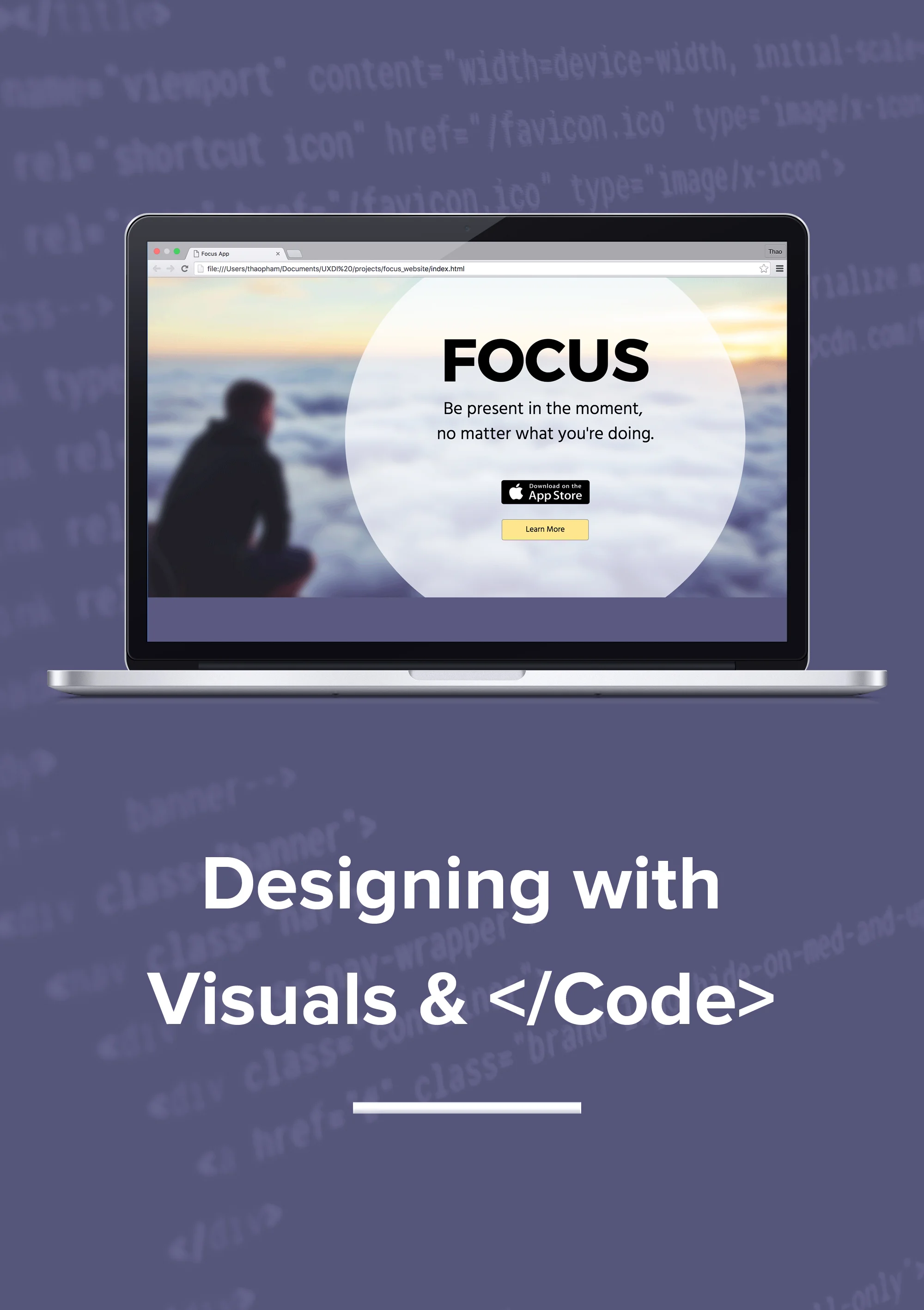
I decided to use simple language and corresponding images to showcase each feature of the app. I chose a stacked block layout because I wanted people to absorb one feature at a time, similar to what the app promotes. The tagline hinted at the universality of the app. The monochrome color palette coupled with the images evoke a sense of calmness, ease and satisfaction, which is the intended effect of the app.

Translating Design to Code
After dissecting my layout and breaking it down into <divs> I started my first line of code. I approached coding like a math problem. I worked on grouping the design elements to minimize the number of steps involved. I had some prior knowledge of HTML and CSS before this project, which was a huge advantage in helping me optimize my design for coding. Working backward and working smart was my strategy. View the promotional website here.
The Outcome
My overall experience with this project was rewarding. Coding the visual design was challenging and at times frustrating. There were moments where I wanted to throw my computer out the window, but the feeling of creating something from nothing but keystrokes was truly exhilarating and fulfilling. For a week I walked in the developer’s shoes, which made me realize that knowledge of programming was critical to effectively collaborate with developers on any team. Being able to communicate my design in a way that developers can understand and implement not only increases efficiency but also quality of the design. That's the reason why I want to further my knowledge of programming, one line of code at a time.