

Creating a More Generous World
In 2014 GoodWorld, Inc. revolutionized online philanthropy. For the first time, anyone can make donations to their favorite causes with a hashtag. Giving is easy as using #donate in a tweet or Facebook post. Goodbye complicated payment forms. Since its inception, GoodWorld has been creating a better world by inspiring generous deeds on social media.
GoodWorld had been strategically planning for a virtual wallet that would further engage their donors and expand their user base. They were looking for a way to integrate the ability to gift and receive donation credits, manage donor matching and incentives. The team at Goodwork came to us to help bring this concept to life. After 2.5 weeks of extensive research, ideation and an unexpected design change, our team revamped the user dashboard to house the virtual wallet.

My Role
I worked in a collaborative team of three UX designers where I focused on contextual interviews, usability testing, visual design and prototyping.

Tools
Sketch, Axure, Pen, Paper, Dry Erase Board
More Than a Wallet
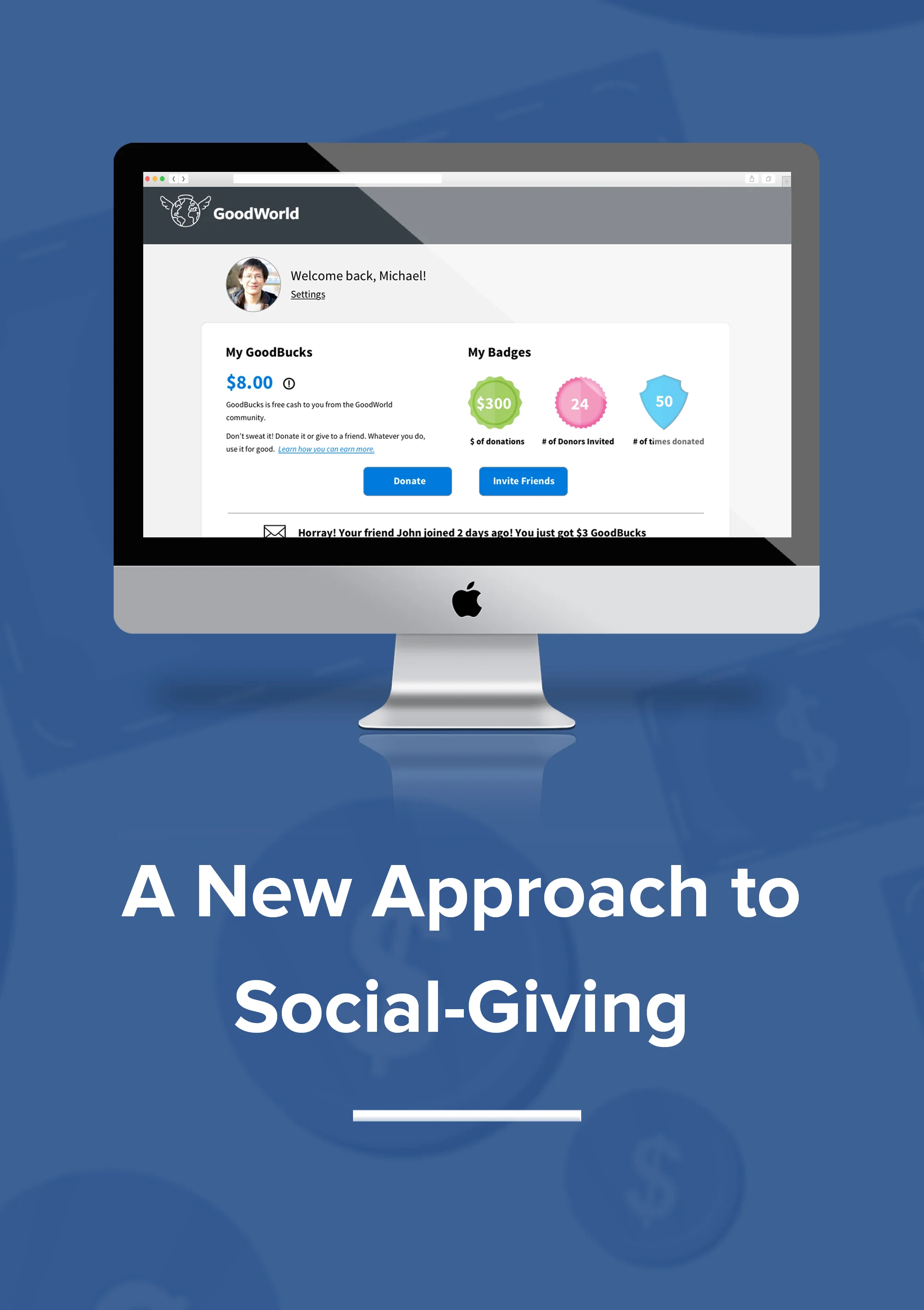
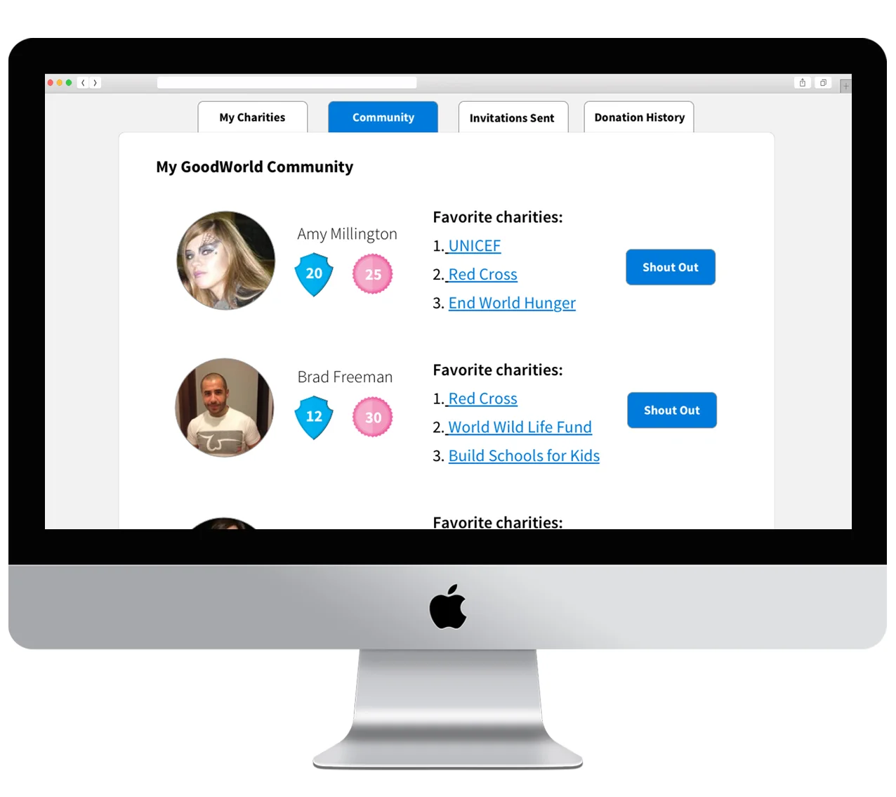
GoodWorld Wallet extends beyond managing donation credits. We designed an end-to-end experience that makes giving even more personal and transparent. Donors can easily see the impact they're making in real-time with progress trackers. Donors can also see friends' activity and favorite charities with the ability to give friends a 'shout out'. The intent was to invite more conversations around philanthropy. The dashboard was designed so that GoodWorld could easily implement various fundraising campaigns with business partners as it continues to grow.
The Challenge
Our team decided to build a mobile app at first because we wanted people to keep philanthropy close to their heart - or within arm’s reach. However, halfway through the design process we adopted a web-based design instead. The design would need fit within GoodWorld's ecosystem and serve its wallet function and more. Most importantly, it needs to motivate donors to come back and also appeals to a broad range of potential donors who are on social media, while nimble enough to accommodate GoodWorld’s growth.
Why Do People Donate?
The client had limited users' data which posed a challenge for us in getting direct user input. We overcame that hurdle by launching a survey to get a sense of people’s sentiments toward spending, charities and donations. With 160 responses (50% males/females), we discovered 3 key points:
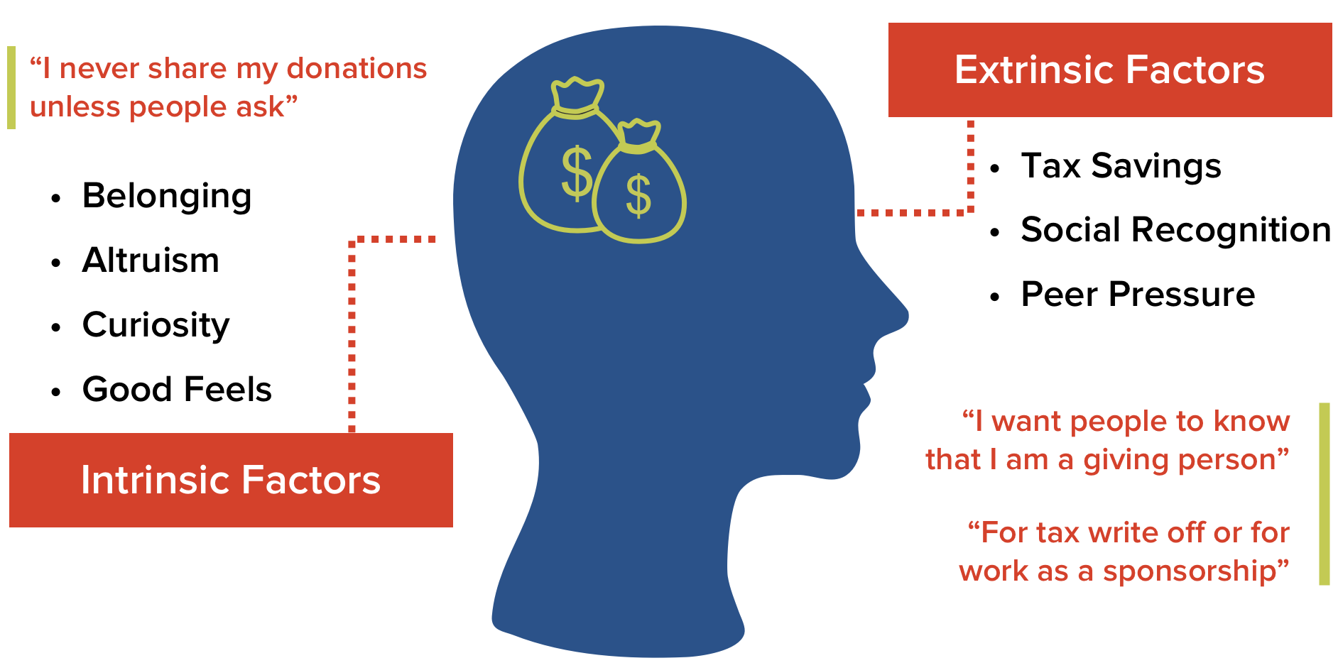
The desire to donate is largely intrinsic- people don't expect to receive anything in return for their donations. However, they can be influenced by external factors such as tax savings, social recognition, and peer pressure.
Donating is seen as a private activity. Because donors are internally motivated to give, they don't see the need to tell others for fear of bragging. But they still want to spread awareness for the causes they support, only if it seems organic and casual.
Positive correlation between happiness and the act of donating. We don't know if happiness led to more donations or the other way around. But we knew that our design needed to produce and prolong these positive emotions.
How Do People Feel About #donate?
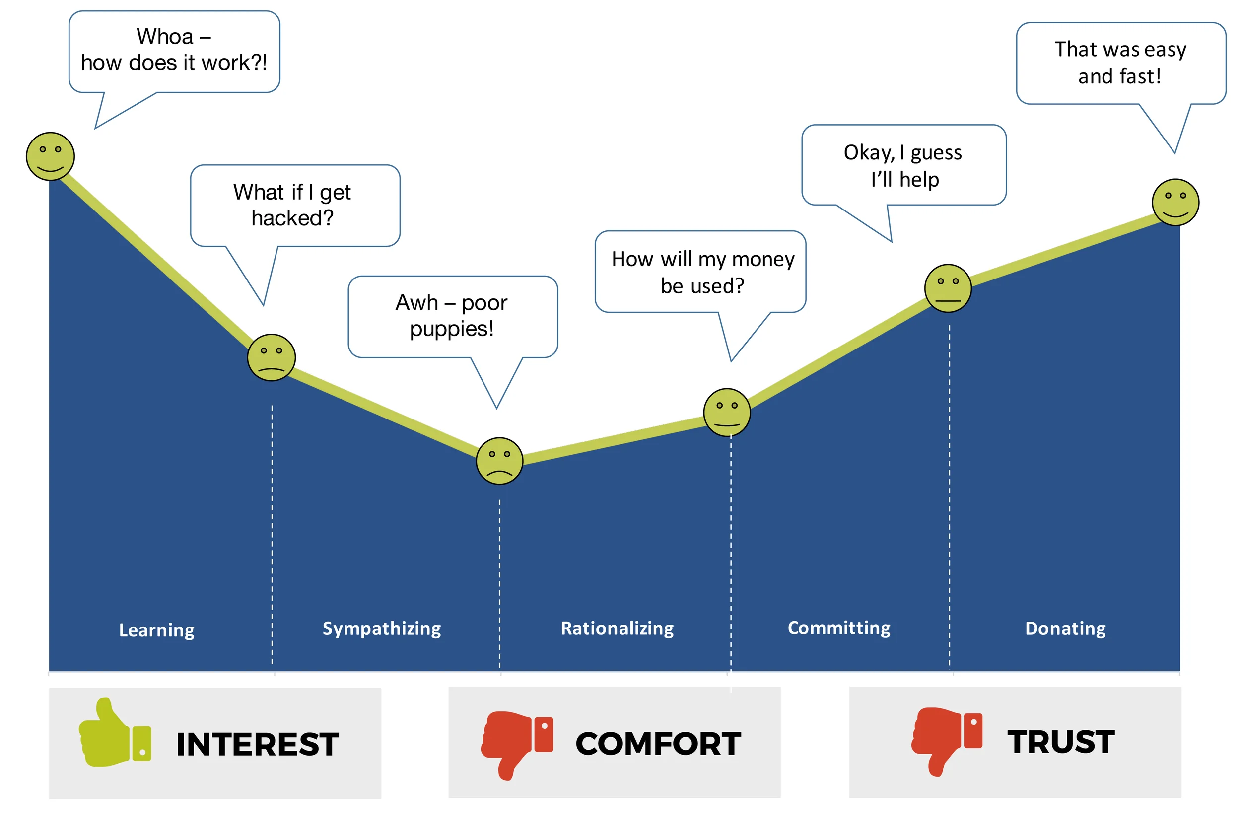
When I asked people unfamiliar with the #donate technology to go through the process from start to finish, I saw that they all exhibited similar levels of discomfort, mistrust and interest across the board. The novelty of the technology piqued their interest, but at the same time, they were concerned about security. What if their Facebook or Twitter account got hacked and the hacker went on a rampage with #donate? Not to mention the intense and lingering mistrust of charities that keeps people from giving in the first place, as seen in the experience journey below.
Changing Perceptions
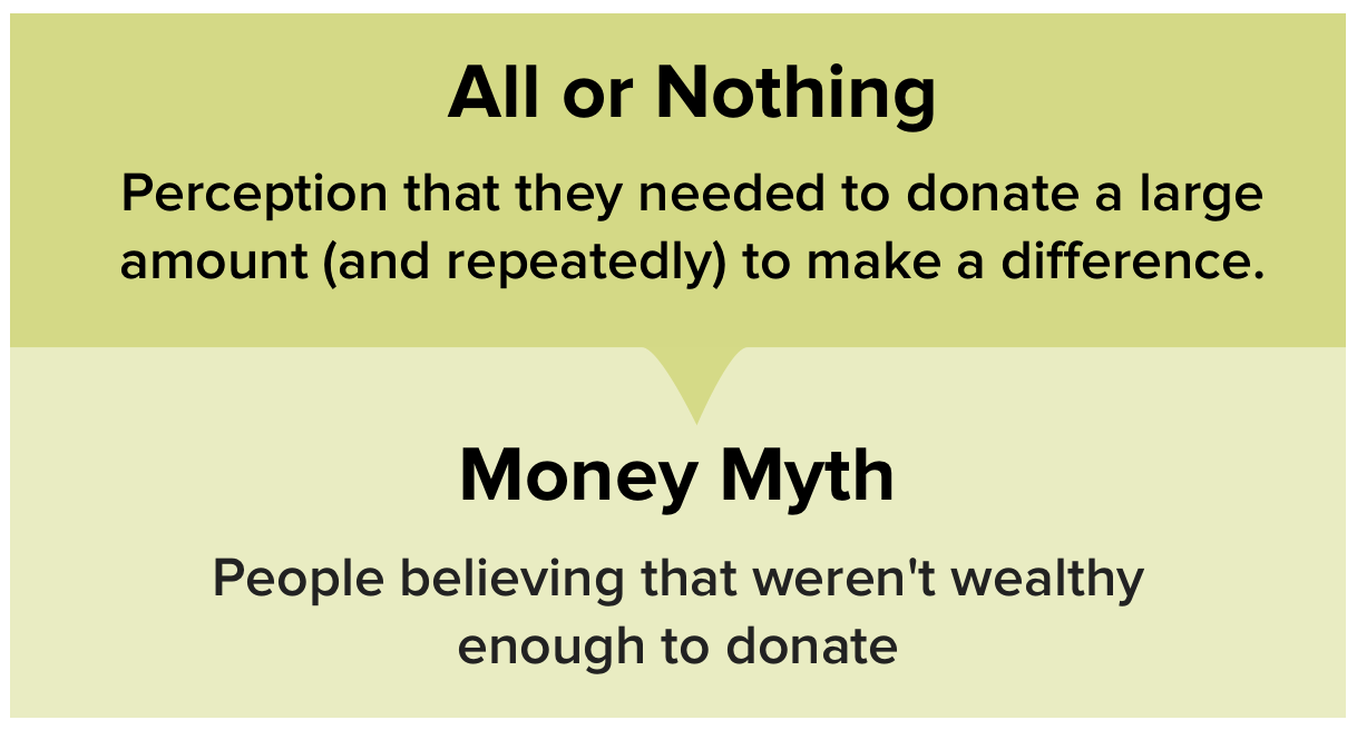
Our team constructed an experiment where we gave participants Monopoly money equaled to their monthly income and then asked them to allocate it based on their typical monthly expenses. As expected, people don't budget for donations like they do with other expenses, which confirmed that donating happens more spontaneously and sporadically. Two other insights led us to build a solution around getting people to make small, spontaneous donations more consistently:
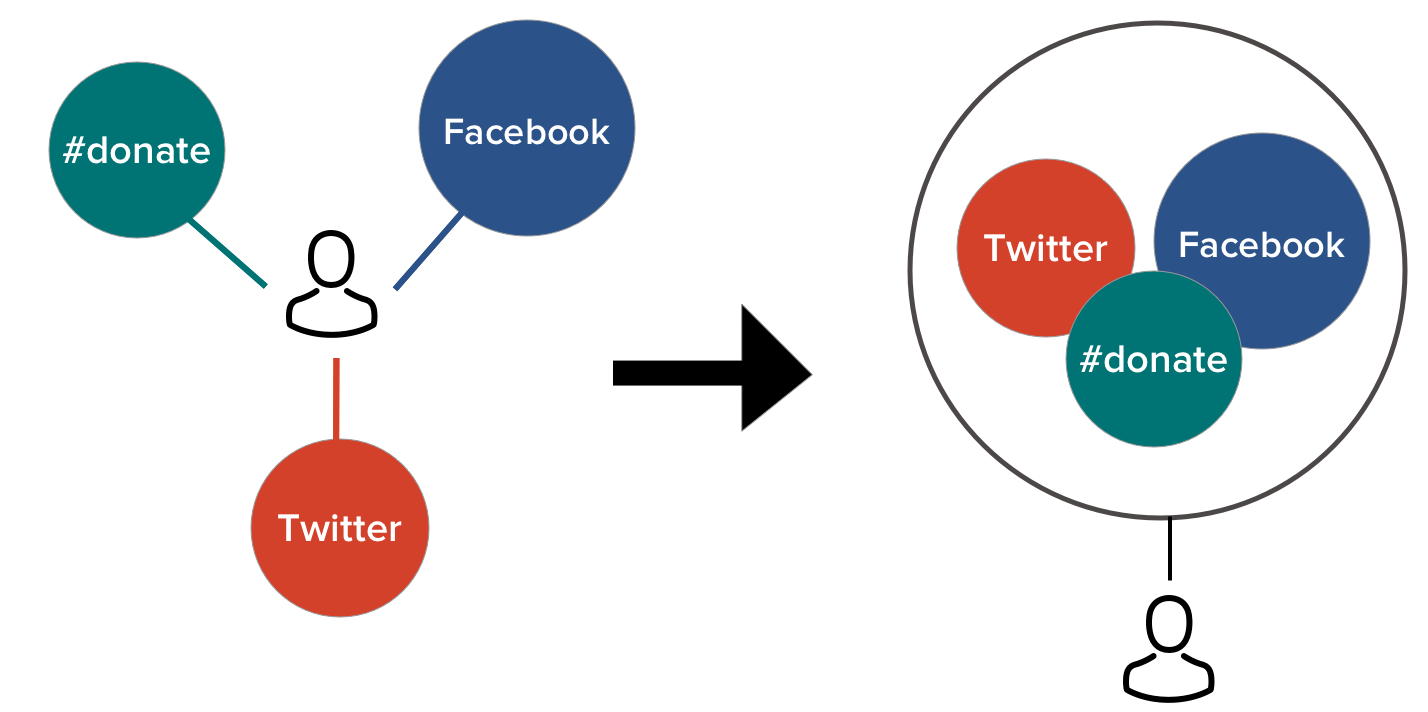
Social Media Integration is Unique to GoodWorld
An afternoon of competitive analysis yielded a big finding: GoodWorld is the only player in the social payment landscape that can bring the platform to its users. With GoodWorld’s #donate technology, anyone can make a donation without having to leave FB or Twitter, creating an experience that is easy, instant and seamless. On the contrary, Venmo (main competitor) grows its platform by tying people to its own social network - Venmo world. Since social media integration is unique to GoodWorld, and we envisioned taking it to next level by designing an integrated and unified social-giving experience.
What about customer engagement? We were inspired by the Starbucks and Swarm apps for their success with getting users to come back to the app. We spent many hours at the whiteboard hashing out various gamification elements to include in our product like badges, progress indicators, and activity stats.
Translating Concepts to Features
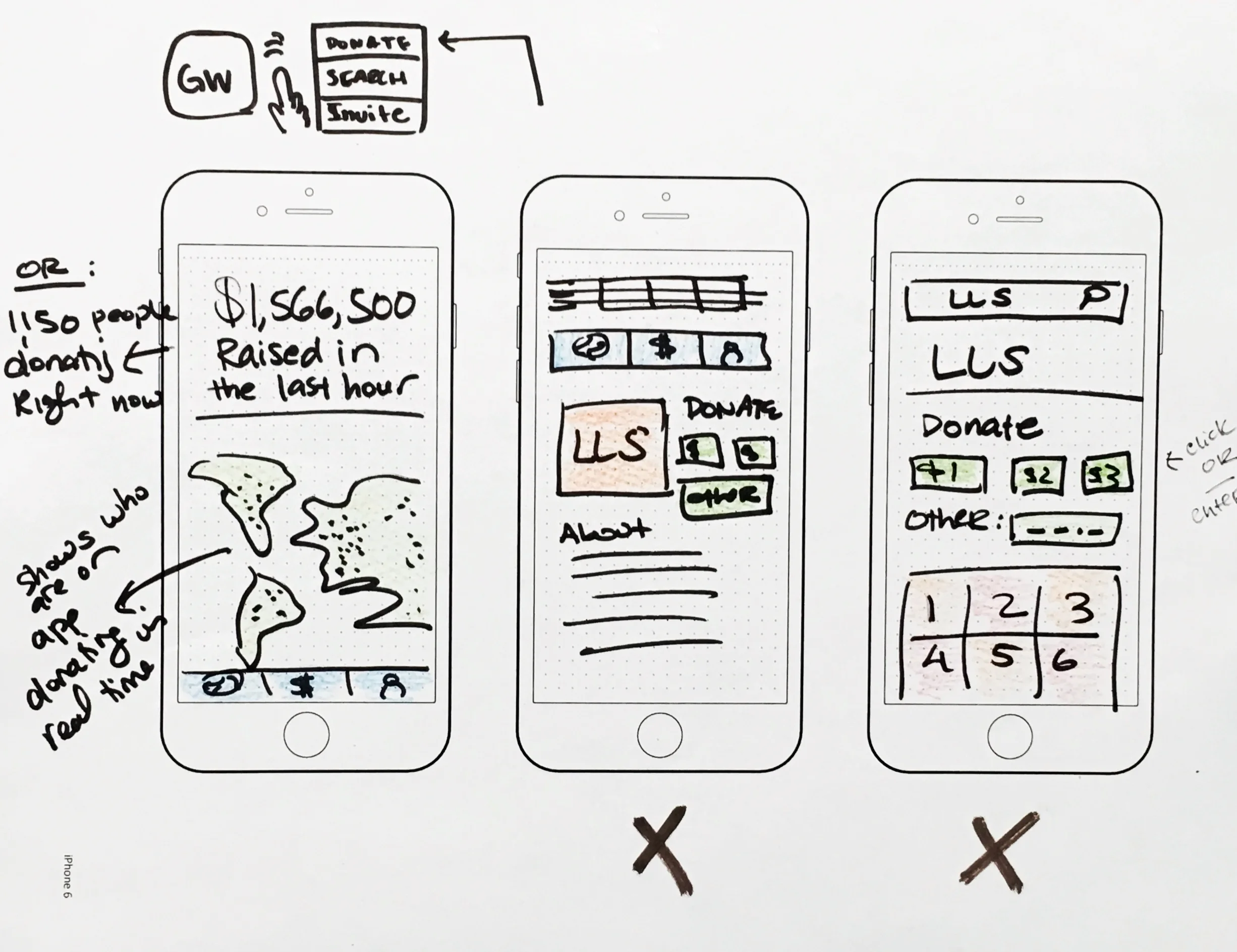
We did multiple rounds of design studio where each teammate sketched out different functionalities of the app - the sky was the limit. We came up with a wall full of idea but narrowed down to the most essential features that would effectively meet the client's business goals.


An Unexpected Design Pivot
We were ready to translate our paper wireframes into digital prototypes before we reached a fork in the road and had to take a different path. The client didn't think a virtual wallet was a viable standalone mobile app at that point in time. The change of scope didn't dampen our enthusiasm about the work we've done, but we had to work faster given we were two days away from product delivery.
If it's not an app then it needs to be a set of features that live within the client's existing framework. But where? We decided it would be the user's dashboard as it is the primary access point for new and existing users.
New Scope - New Solution
The design pivot prompted us to change our problem statement and corresponding solution. We worked non-stop for the next few days and applied our initial research and design concepts for the app in the new dashboard featuring 3 core components: wallet, community, game elements

The Vision
A Communal and Empowering Experience
In developing the dashboard, we focused on the user goals and what we wanted them to feel when using it. The goal was for users to come back and tell their friends about GoodWorld, because they trust the platform and receive gratification from it. Beyond the wallet feature, we saw opportunities to build an emotional connection with our users by:
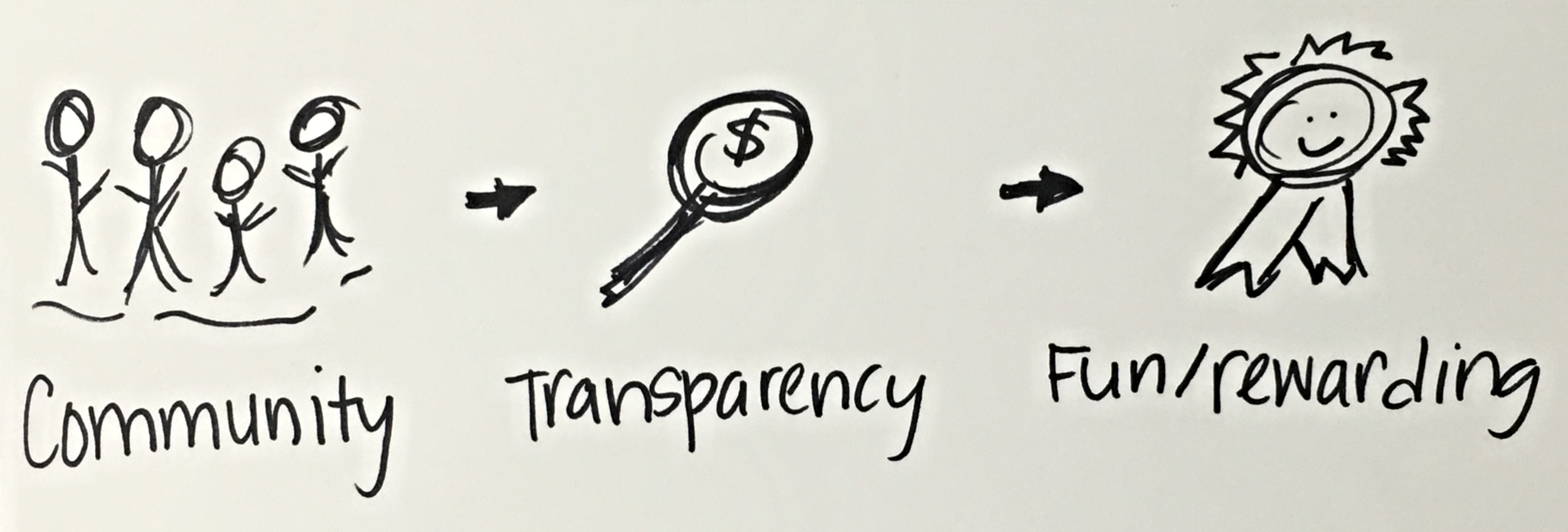
Building a community: activating a sense of belonging - you're part of something bigger. We live in a world of abundance where giving and receiving go hand in hand.
Building trust with transparency and social proof: The platform is honest, nonintrusive and supportive.
- Building fun factor: Chores are boring and are done solo. Donating is not a chore. GoodWorld donors are never alone in their journey.
Testing and Iterating
With only two days left, we were under a lot of pressure to move fast. From the app wireframes, we went straight to hi-fi prototyping for the dashboard and started testing as soon as we generated a prototype. I spearheaded 5 rounds of usability testing with another teammate and was responsible for the subsequent iterations.
We found that people were confused about the donation credits they could get from GoodWorld. To address this, I changed the UI so that users could easily get more information about what it is and how they can earn more straight from the dashboard. We renamed 'GoodWorld Credits' to 'GoodBucks' for memorability and differentiation from credit card.
Community component of the dashboard was critical for addressing issues related to comfort and trust. We found that people were confused about 'Total Team Earnings’ and expected to an end-goal or prize for being part of a team. Users responded well to seeing their FB and Twitter friends (who are also GoodWorld donors) on the dashboard. However, seeing their friends wasn't enough. Users wanted to interact with their friends in some ways, so we allowed for more interactivity through the dashboard. We wanted to foster a more collaborative environment so we allowed donors to give ‘shout outs’ to their friends via social media and excluded the ability to ‘challenge’ others. We saw that people were surprisingly curious when seeing their friend’s activity stats on GoodWorld as well as their top three charities. Social proof is key to building trust and heighten interest.
Progress trackers are shown as badges. The user's activity is captured in real time ($ donated, number of friends invited, number of donations made). We confirmed that people liked the badges and said that it helped them become more self-aware. The intent was to engage the users and communicate the impact that they're making. People didn't like collecting badges in the context of donating. Moreover, they shied away from pushing their badges on social media but didn’t mind GoodWorld friends seeing their badges, but with donation amounts kept private.
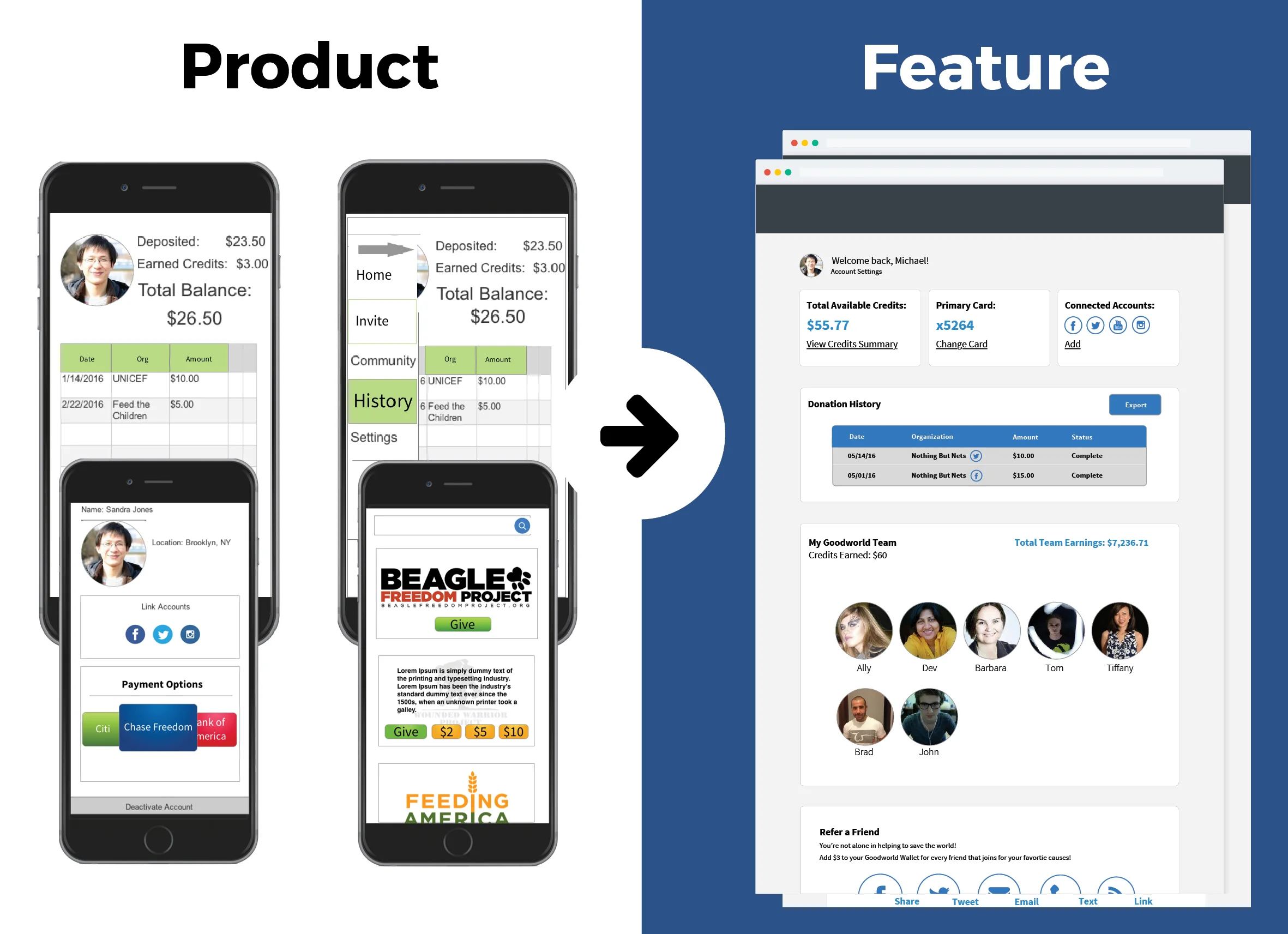
The Reveal: Before & After
The Outcome
The design was well received by the GoodWorld team. They said what we brought to the table was invaluable in expanding their vision for the wallet and what it could achieve. They appreciated us for taking a holistic approach to solving-problem. They came to us for a way to manage donor credits, but I designed more than a UI for the wallet. I looked at how we could build an end-to-end experience around the wallet - paying close attention to the user’s needs, expectations and overall experience.
Lastly, I took away 2 important lessons from this project:
Embrace Change: the change of scope was a major disruption to my workflow, especially a few days before the deadline. However, I pushed forward without much loss of enthusiasm. This was possible only because I cared more about finding the right solution. Change is the only constant in life and I’m learning to expect it. In retrospect, I would have liked to do progress check with the client sooner and more often.
Do Not Assume - Test It: The client and our team were convinced that texting was a surefire method for referrals. We were shocked to find that it actually turned people off. As unsettling as it was, I learned that understanding personal biases and assumptions is so critical in my line of work. If we had more time, I would have liked to do usability testing with current GW donors to assess the viability of our design.